Most incarcerated people will return home; the Census Bureau should count them there
Using an incarcerated person’s last known home address when redistricting gives the most accurate picture of where they reside.
by Aleks Kajstura, May 14, 2024

Incarcerated people return to their home communities after release. That’s a fact that is obvious to anyone who lives in a community hard hit by mass incarceration. Yet when states seek to end prison gerrymandering by counting incarcerated people at home for redistricting purposes, some people ask why we should use someone’s home address — concerned that they might not return to that exact place after release or even might stay in the prison town.
Unfortunately, because we can’t predict the future and because prisons and jails generally don’t track where people go after their release, this has been a hard question to answer. However, we collected several unique datasets to fill this gap and provide the best evidence possible of where people go after being released from prison. We found:
- Incarcerated people don’t generally stay in the area of the prison after their release.
- Incarcerated people almost always go back to the communities they came from — if not the exact address they lived at before their arrest.
- Counting incarcerated people in prisons is likely the least accurate place to count them.
In theory, every legislative district within a state is supposed to have the same population to ensure everyone has equal representation from elected officials. However, the Census frustrates this goal by counting nearly 2 million incarcerated people as residents of the places in which they are detained instead of at their home addresses. The resulting Census data leads to “prison gerrymandering” — legislative districts that skew representation in favor of people who live near prisons and other correctional facilities.
To avoid prison gerrymandering, states have taken it upon themselves to count incarcerated people at home in their redistricting data. In practical terms, this means counting people at the pre-incarceration address on file with the Department of Corrections.
People don’t stay near the prison after release
There are two widely-accepted truths about mass incarceration:
- Black and Hispanic people are consistently overrepresented in prisons
- In most states, prisons are built in rural, largely-white communities.
With this in mind — along with the fact that more than half a million people enter and leave prison every year — you can conclude that if even a small portion of people stayed near the prison after release, those communities would, over time, begin to look similar to those on the inside, but that’s not the case.
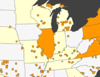
In 2015, we released a report that explored the racial geography of mass incarceration. It showed that in 208 counties with prisons, the portion of the free population that was Black was at least 10 times smaller than the portion of the prison population that was Black. These trends were so strong, in fact, that we found 161 counties where the number of incarcerated Black people was actually bigger — by raw number — than the number of free Black people.
If people in prison stayed in those communities after their release, these dramatic disparities would not exist.
People go home after release
Unfortunately, while prison systems generally keep people’s home addresses on file, they don’t track whether they actually return to that address upon release. However, addresses for people on probation and parole can be a reasonably accurate proxy to fill this gap. That’s because a significant number of incarcerated people are on probation or parole after their release.
Comparing these two sets of addresses, we can get a sense of whether people return to where they came from after incarceration. If the portion of incarcerated people from an area is similar to the portion of people on probation or parole from that area, you can reasonably conclude that people are returning to their home communities after incarceration.
Rhode Island serves as a useful example for this analysis because all of its correctional facilities, including pre-trial facilities, are located in one correctional complex (in the city of Cranston). In most states, people are held pre-trial in jails, usually close to home, but in Rhode Island, they are incarcerated equally far from home, whether they are held for a few days or a few years.
We looked at the state’s probation and parole data for 2020 and compared it to the state’s 2020 redistricting data that counted incarcerated people at home.1
| Municipality | Percentage of incarcerated people from the city | Percentage of people on probation or parole from the city |
|---|---|---|
| Providence | 38.2% | 33.0% |
| Pawtucket | 11.9% | 11.2% |
| Woonsocket | 8.1% | 8.2% |
| Cranston | 7.6% | 6.2% |
| Warwick | 4.6% | 5.4% |
Examining this data for the five largest cities in the state, you see that the numbers align quite closely, reinforcing the fact that incarcerated people almost always return to their home communities after their release.
It is worth noting that Providence, the state’s biggest city, represented a larger portion of the incarcerated population than the probation/parole population. While some may be tempted to say this disproves our point, it is important to remember the context of this time period. The probation/parole data was from December 2020, at the pandemic’s peak, when many urban areas saw their populations dramatically decrease due to health and economic concerns and the desire for more space. Based on the patterns in the other communities, it is reasonable to conclude this data represents pandemic-era fluctuations and should be treated as such.
Importantly, you can also see more incarcerated people come from Cranston than are there while on probation and parole. This is another sign that most people don’t stay near the prison after incarceration unless they are from there originally.
These numbers aren’t a perfect match, which means that the exact address someone ends up at is sometimes different than the one they had on file while incarcerated. However, it clearly shows that people almost always return to their home communities after incarceration.
Prison is the least accurate place for the Census Bureau to count incarcerated people
Even if someone is unconvinced by the data showing that incarcerated people are likely to return to their home communities after their release, there are plenty of reasons — backed up by hard data — that make clear that by counting incarcerated people at prisons, the Census Bureau is choosing the least accurate option.
People are incarcerated further from home than most people choose to live
Over 60% of people in state prison are held at least 100 miles from their homes. Importantly, according to the Census Bureau, 80% of people in the U.S. who are of similar median age to the incarcerated population (roughly 30-years-old) still live within 100 miles of where they grew up.
When someone is incarcerated, they are moved far from their daily surroundings and usually locked up somewhere they never visit on their own — let alone live. They’ll likely never know anyone outside of the prison walls, nor rent a house, visit a business, or attend a community event there. So why would the Census Bureau decide this was their home?
People counted at the prison on Census Day aren’t likely there for long
There is a common misconception that a person in a prison will be in that facility for a long time — this is the mistaken belief that is the foundation of the Census Bureau’s choice to count incarcerated people there. But this simply isn’t true.
The average time served by people in state prison is 2.7 years, with this “average” pulled up by the few people serving very long sentences; the median time served is 15 months. Short stays in prison are common. For example, in Rhode Island, the median length of stay for people serving a sentence in the state’s correctional facilities is only 99 days. This means that most people counted at a state prison on Census Day will spend the vast majority of the next decade outside the prison walls.
Even people incarcerated away from home for a year or longer are not in one place. They move between multiple facilities. Nationally, 75% of people serve time in more than one prison facility, 12% of people serve time in at least five facilities before returning home. While they are being shuffled between facilities, incarcerated people maintain a usual residence elsewhere; their pre-incarceration home remains the only actual stable address.
A home address is the most accurate option
The home address someone has on file with the Department of Corrections may not be the exact place they return to after incarceration. However, it is a close approximation of where they reside through and after incarceration. While some of these address records may vary in precision, the one address we know is wrong is the facility address.
States that adjust their redistricting data to count incarcerated people at home use the home addresses contained in their Departments of Corrections records. This practice creates redistricting data that better reflects the populations of communities hardest hit by mass incarceration and communities that contain large prison populations. The Census Bureau should count incarcerated people at home in the 2030 Census using home address data as the states have done.
Grab our one-pager about this issue at https://www.prisonpolicy.org/factsheets/home_addresses_one_pager.pdf.
Footnotes
-
The Probation and Parole data is from December 2020 and the redistricting data is from April 2020 — these are the closest dates available. While the distribution of people in prison in April 2020 geocoded to their hometowns is not a perfect match to the hometowns of people on probation and parole in December 2020, it is close enough to draw some conclusions. It clearly shows that the towns where incarcerated people come from are the same towns where incarcerated people go after release. ↩


